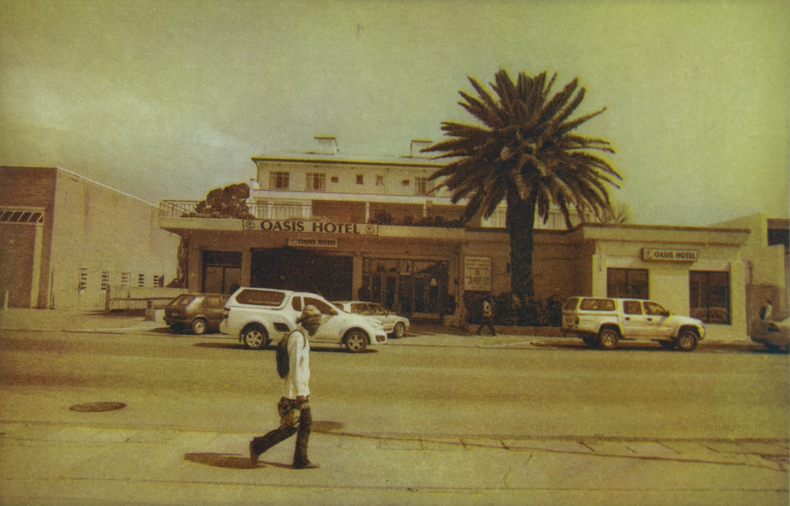
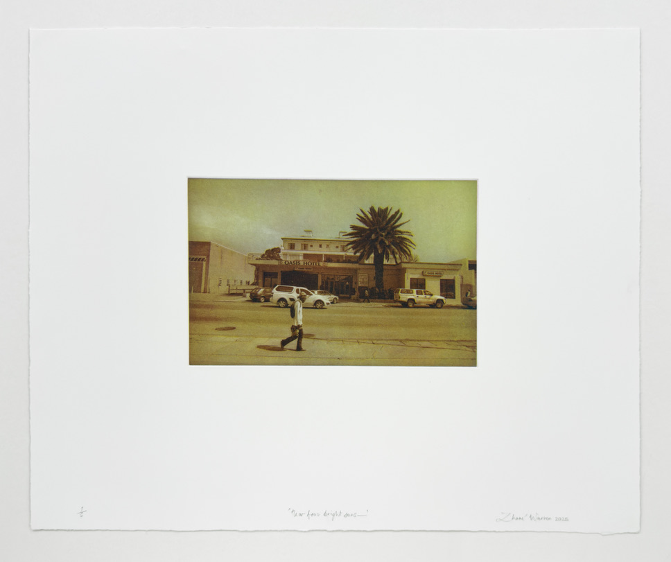
Near four bright suns—
2025
À la poupée three-plate colour photogravure on Hahnemühle Bütten 350 g/m²
Edition of 6
To etch the three copperplates for Near four bright suns—(2025), I used the photogravure technique. My starting point was a black-and-white silver-gelatin photograph. The process began by scanning a 35-mm negative, inverting it, and producing a continuous-tone film positive.
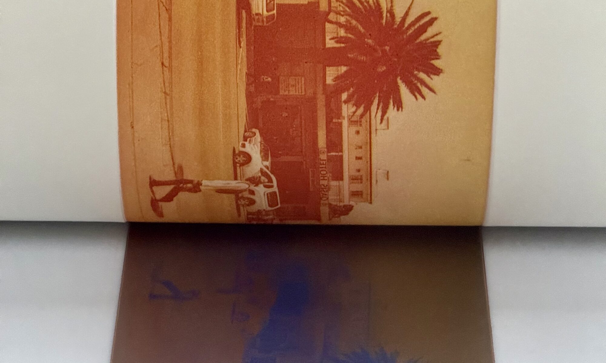
I then exposed this same positive three times onto light-sensitive gelatin “tissues”. Each exposure was different, so each tissue carried a distinct tonal density once transferred and etched onto copper: dark and dense; full range; and light and low-information.

If the three copperplates are printed separately in black ink, the impressions differ: one reads as the darkest, one as the lightest, and the third as a relatively accurate rendition of the positive image.

The real transformation happens when the plates are printed together. By printing the three copperplates in sequence, I can layer the inks to produce a wide range of hues, turning the original black-and-white silver-gelatin photograph into a colour image.

For this work I stayed loosely within the RYB (red, yellow, blue) trichromatic colour model. For the red, yellow, and blue components, I expanded the traditional triad into four inks—lemon-yellow, ruby-red, cerulean, and turquoise-blue—from the Charbonnel etching ink range. Both cerulean and turquoise-blue were applied selectively, à la poupée, to the “blue” plate. As these vibrant colours blend in printing, they produce an image that moves away from literal depiction toward an imagined representation of a distant phenomenon.


Because of the tonal density etched into each copperplate, I anticipated that the RYB model would translate effectively when printing from the three plates. RYB is a foundational colour system in art education, and 18th-century printers such as Jacob Christoph Le Blon laid much of the groundwork for trichromatic printing by using this system for mezzotints. His method provides an important historical precedent for my use of RYB in Near four bright suns—.